Skip to content
Digitalmohawk

03 / Coca-Cola

One drink, from a cooler door to a kiosk canopy

Brand and retail work for Coca-Cola in the Philippines: a premium kiosk, cooler wraps, combo posters and the social cutdowns that go with them. The copy is in Tagalog, because that is the language the offer is being made in.

The brief

A brand this size arrives with the logo, the red and the bottle already settled, so the work is everything underneath. One promotion has to hold together as a poster in a window, a wrap on a cooler door, a square on a phone and a banner on a till screen, and each of those is a different shape with a different reading distance.


What we built

  1. 01

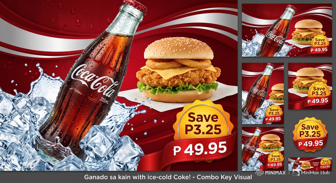
    One key visual per promotion, then a family of crops for every placement it has to appear in, rather than a fresh layout each time

  2. 02

    Copy written in Tagalog instead of translated into it, so 'Ganado sa kain with ice-cold Coke' reads the way the offer would be said out loud

  3. 03

    Price and saving carried on a badge that survives every crop, since that is the one element a customer must be able to read from across a shop

  4. 04

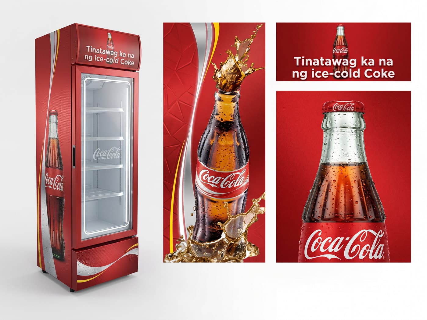
    Cooler wraps designed against the fridge, with the artwork shown flat beside the mock-up so a printer and a merchandiser see the same thing

  5. 05

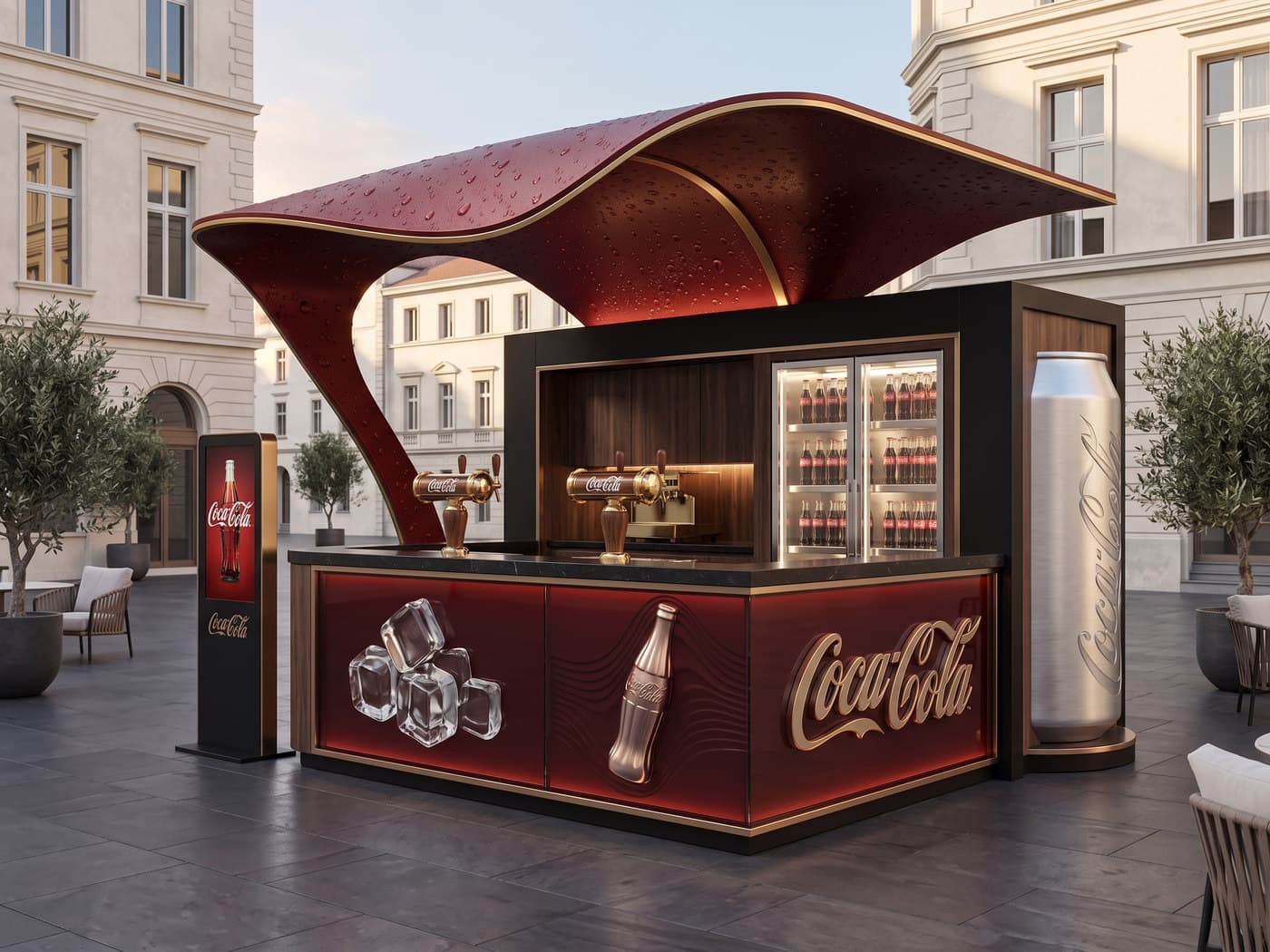
    A kiosk built as a piece of architecture: a canopy shaped like poured cola with condensation on it, brass fittings, and a full height can standing in for a column

  6. 06

    Product photographed cold in every piece, ice and condensation included, because the promise is temperature before it is taste
The pieces

A rendered Coca-Cola kiosk in a paved square: a curved dark red canopy beaded with condensation over a black and red serving counter with brass taps, an illuminated fridge of bottles, an embossed Coca-Cola logo on the counter front, a digital totem to the left and a full height brushed aluminium can to the right.
The canopy is the drink itself, curved like a pour and beaded with condensation. Every surface is either lacquer, brass or chilled metal.
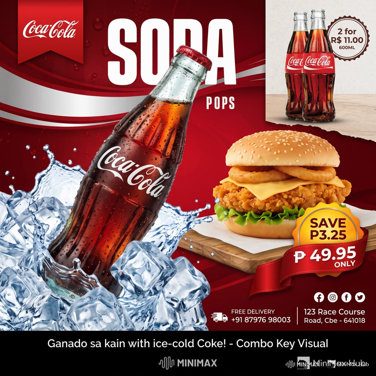
A combo key visual of a Coke bottle in ice beside a chicken burger, with a 'Save P3.25' badge and a price of 49.95 pesos, shown alongside six smaller versions of the same artwork recomposed for different formats.
The reason the key visual exists. One master and its family of crops, from a wide banner to a narrow tile, each recomposed rather than squashed.
A Coca-Cola cooler wrapped in red vinyl reading 'Tinatawag ka na ng ice-cold Coke', shown beside the flat artwork panels used to print it.
The cooler wrap and the flat artwork side by side, so the printer and the person installing it are looking at the same thing.
A square social post for the combo deal, with the Coke bottle in ice, the burger, the savings badge, delivery details and social icons.
The square cutdown. Same visual, recomposed for a feed, with the offer and the phone number added.
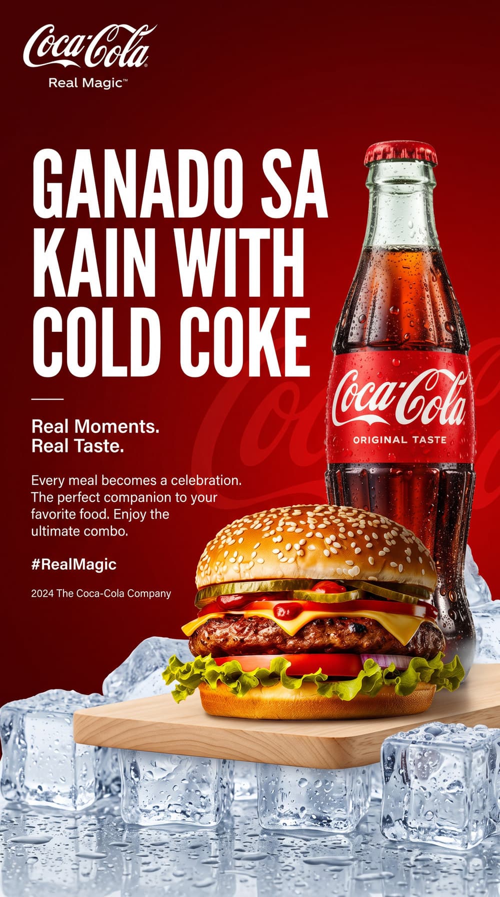
A portrait Real Magic poster headed 'Ganado sa kain with cold Coke', with a Coke bottle and a burger on a board over ice.
Ganado sa kain. Written in Tagalog rather than translated into it, which is the difference between speaking to a market and at it.
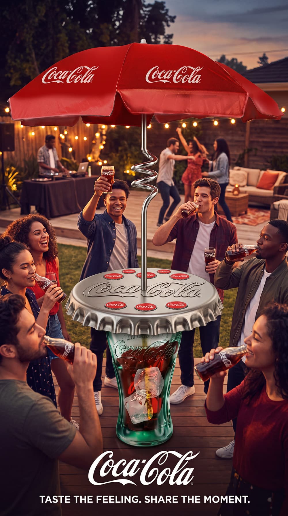
A portrait poster of a backyard party at dusk, people drinking Coke around a table made from a giant bottle cap on a glass bottle base, under a Coca-Cola umbrella, with the line 'Taste the feeling. Share the moment.'
The table is a bottle cap on a glass. Furniture drawn out of the packaging, which is the oldest trick this brand has and still the best one.

Outcomes

  • A promotion ships as one visual and a set of crops, not as a dozen separate layouts

  • The price badge stays legible at every size the artwork is used at

  • The same brand reads across print, a cooler door, a phone and a built kiosk