The envelope does not have to say Drug Education Network
DEN writes and prints the alcohol and drug information used across Tasmania, by schools, workplaces, community organisations and by people looking for themselves. Those are different readers arriving for different reasons. A teacher ordering fifty booklets and someone reading at midnight about their own drinking need the same library and almost nothing else in common. The site had to serve both without making either feel like the other was the intended audience.
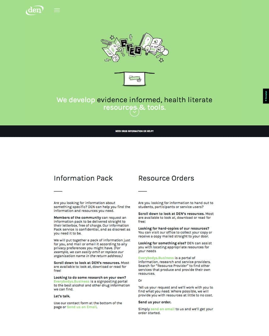
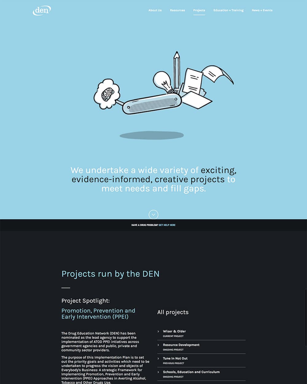
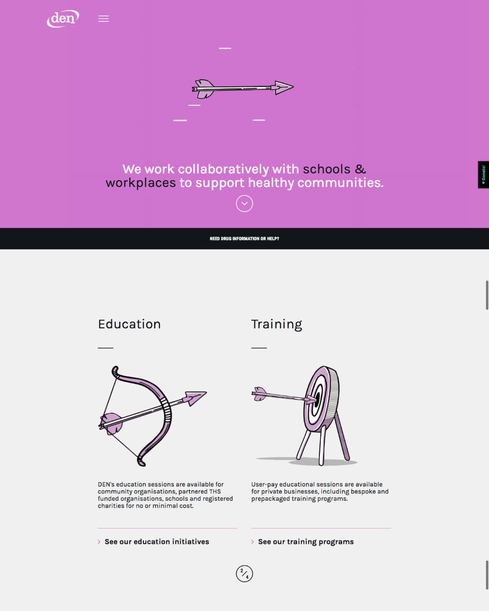
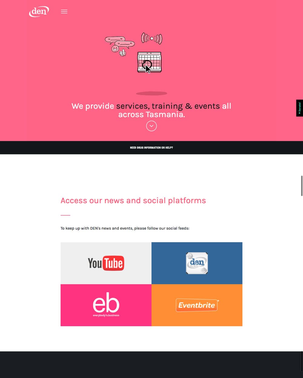
A colour and a set of drawings for each of the five sections, so you know where you are before you read the nav
A black bar under every hero, in the same place on every page, asking whether you need drug information or help
Information packs posted out free, with the option to leave the organisation's name off the return address
Two paths on the resources page: a community member wanting information, and a professional ordering copies to hand out
A search across the whole resource library, so it is usable by someone who does not know what is in it
Education and training separated by who pays: no or minimal cost for schools and funded organisations, user-pay for private business
Drawings of objects rather than photographs of people, so nobody on the page is cast as an addict
Help sits in the same place on every page, one click from anywhere on the site
Someone can ask for information without the organisation's name turning up on their doorstep
A teacher ordering copies and a person reading for themselves take different paths to the same library
The site reads as a health resource rather than a warning poster