Skip to content
Digitalmohawk

31 / Mergence Global

The cities do the arguing

Two websites for one owner, built directly with founder Cory Ruth in Atlanta. Mergence Global is a management and technology consultancy working across Atlanta, Moscow, Tel Aviv and Mexico City. Mergence Capital sources foreign capital for US commercial real estate.

The brief

The firm was founded in 2020 and competes with consultancies a century old. Its pitch is that those incumbents are outdated, selling expensive slide decks delivered by junior associates. There was no back catalogue to point at yet, and a conventional site would have contradicted that pitch on the first screen. The second brand talks to real estate investors rather than corporate buyers, so it had to read as related without reading as the same company.


What we built

  1. 01

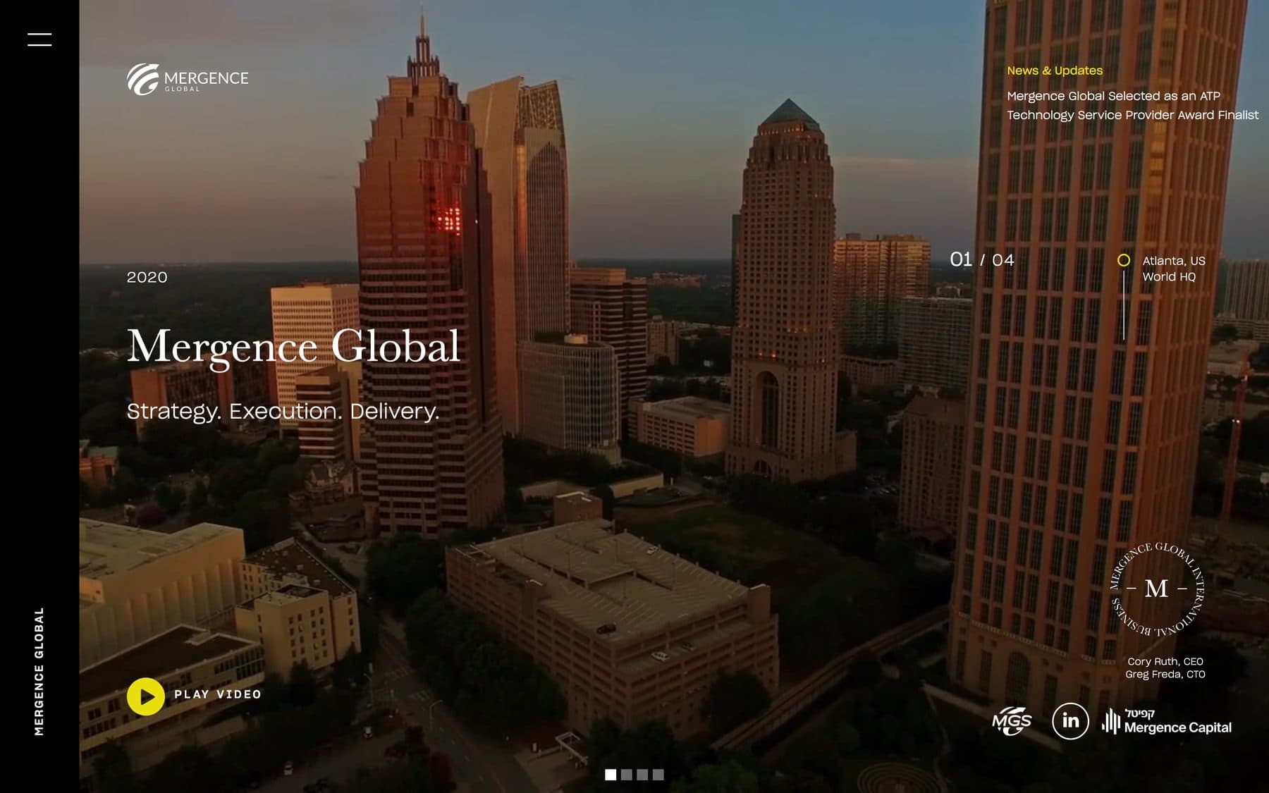
    Four full-bleed aerial films of Atlanta, Moscow, Tel Aviv and Mexico City, counted 01/04 with each city and the role it plays. Evidence, for a firm too new to have case studies

  2. 02

    A fixed black rail down the left edge carries the wordmark vertically, so the frame stays constant while the film changes

  3. 03

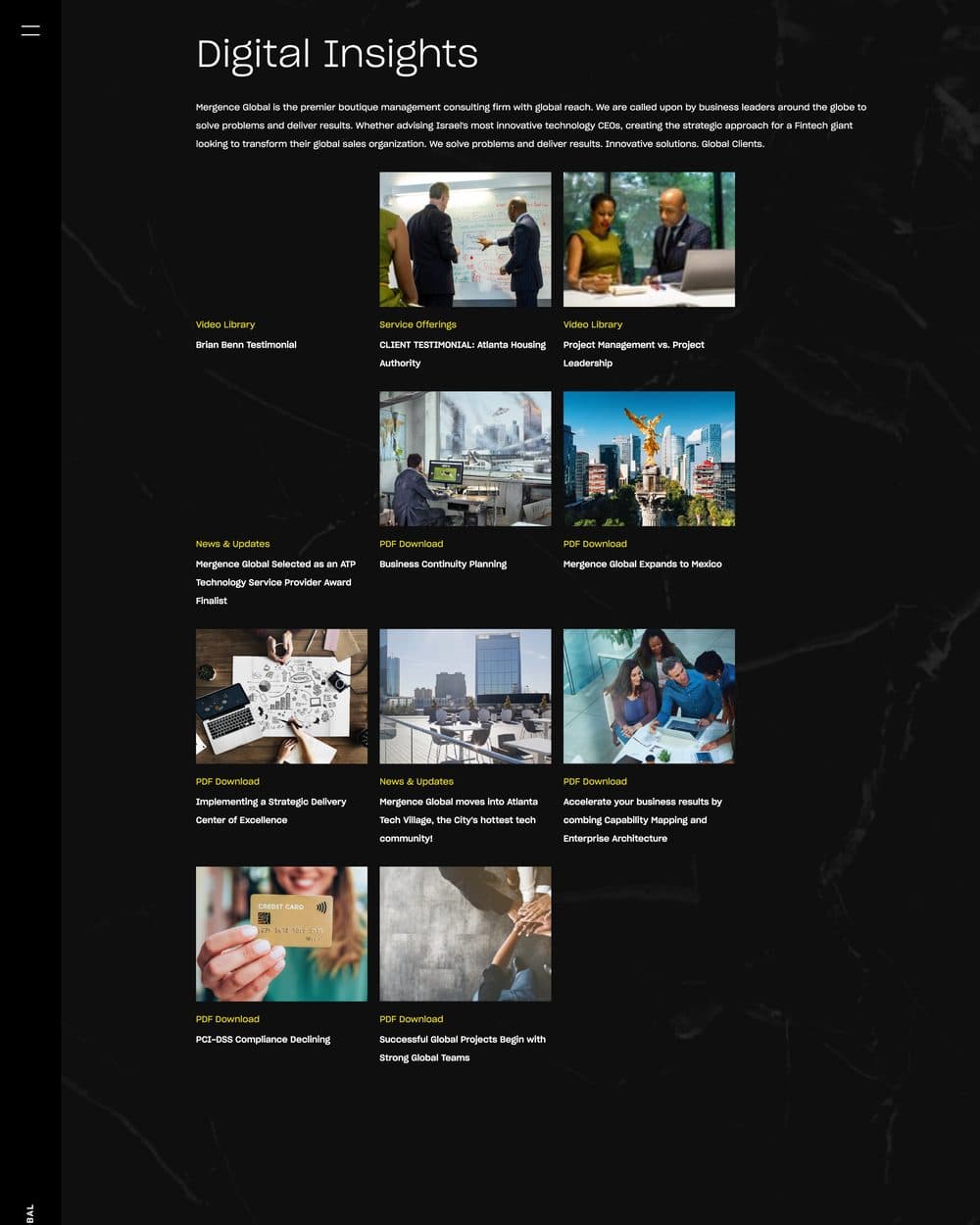
    Digital Insights as one grid of everything the firm publishes (video, PDF, service offering, news), each tile tagged by type

  4. 04

    Mergence Capital built on snapped full-screen sections, so a dense investment prospectus is paged through

  5. 05

    The same system runs across both: serif display, full-bleed imagery, near-zero chrome. Ground and accent separate them. Yellow on black film for the consultancy, orange over daylight for the capital arm

  6. 06

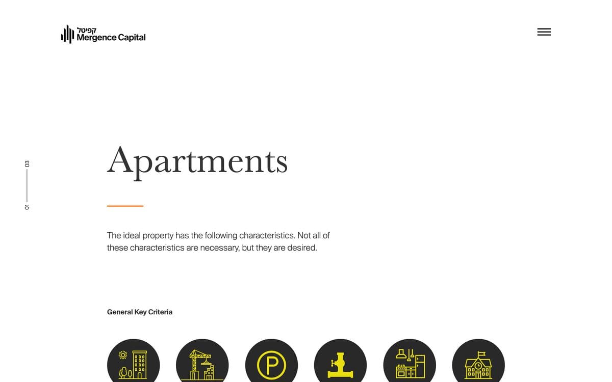
    Capital's funding pages flip to a light ground with drawn property icons, so the deal criteria read as a document

  7. 07

    Two sub-brands absorbed without new sites: Mergence Global Sourcing under Global, and a bilingual Hebrew and Latin lockup for Capital
Screens

The Mergence Global homepage: an aerial film of the Atlanta skyline at dusk, with a serif 'Mergence Global' and the line 'Strategy. Execution. Delivery.', a 01/04 counter marked Atlanta, US (World HQ), and a black rail down the left edge carrying the wordmark vertically.
Slide one of four. The counter and the city sit where a scroll prompt normally would, because there is nothing below to scroll to.
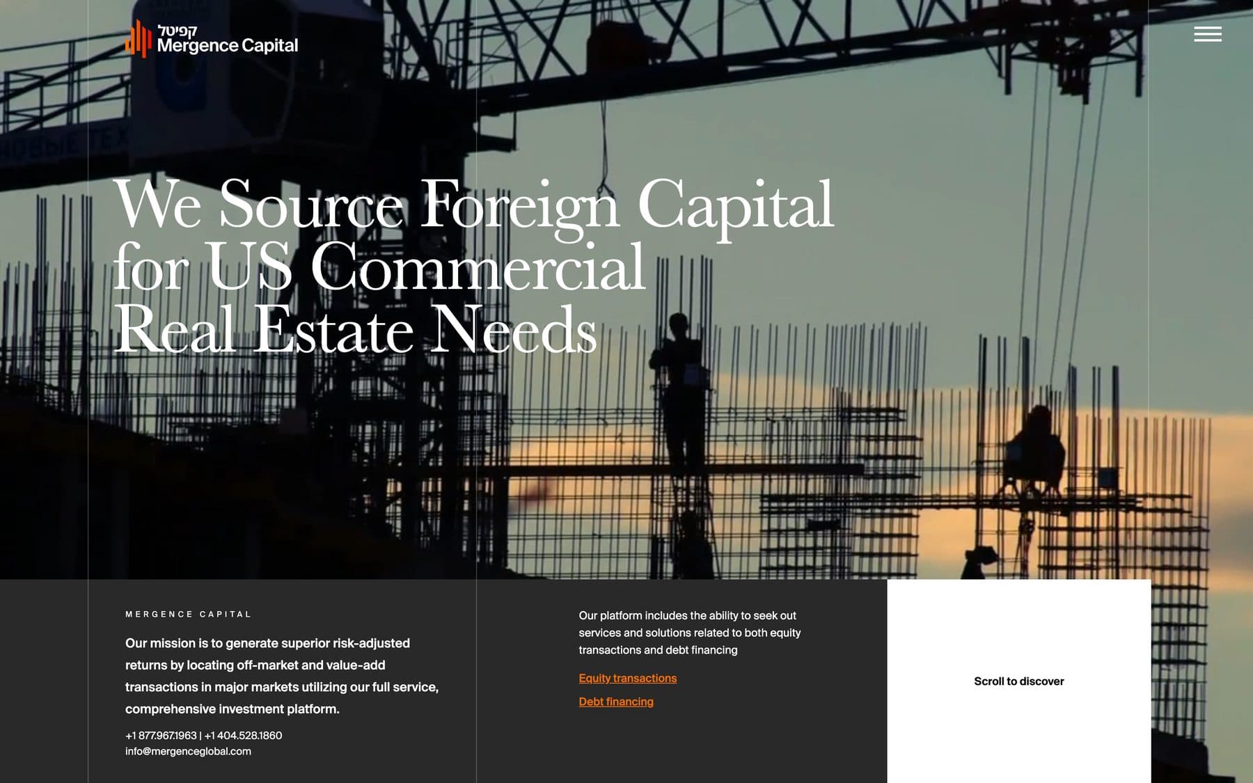
The Mergence Capital homepage: a construction site silhouetted against a dusk sky, headed 'We Source Foreign Capital for US Commercial Real Estate Needs' in a serif display, with a bilingual Hebrew and Latin lockup top left, a dark band carrying the mission and contact numbers, and a white 'Scroll to discover' panel.
The second brand. Same bones: serif display, full-bleed image, almost no chrome. But orange over daylight instead of yellow over night film. Clearly the same family.
The Digital Insights page on a black marble ground, showing a grid of resource tiles each tagged in yellow as Video Library, Service Offerings, News & Updates or PDF Download.
Everything the firm publishes in one grid, tagged by type. A video, a whitepaper and a press item are the same object with a different label.
The Mergence Global Sourcing page: a container ship under gantry cranes, headed 'Strength. Scale. Seamless Trade.' with the subtitle 'Strategic Scrap Metal Sourcing and Logistics between the U.S. and South Asia', carrying an MGS logo top left and the Mergence Global mark bottom right.
The sourcing arm gets its own mark and its own hero, inside the parent system. A sub-brand rather than a second website.
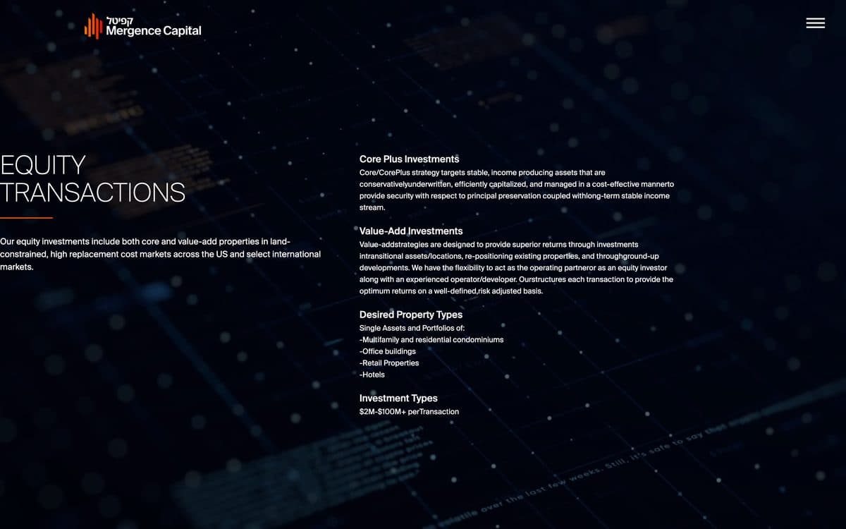
The Equity Transactions screen on Mergence Capital: a dark navy ground with a network texture, the section title running off the left edge, and dense two-column detail covering core-plus and value-add strategies, property types and transaction sizes.
A full screen per section rather than a long page. The prospectus detail is dense on purpose. This reader wants the numbers, not a summary.
The Apartments funding page: a light ground with a serif heading, an orange rule, and a row of circular custom icons setting out the general key criteria for a desirable property.
The funding pages flip to a light ground with drawn property icons. Criteria read as a document you could act on.
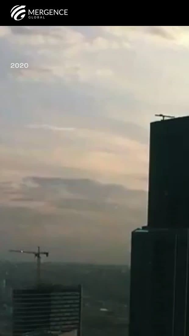
The Mergence Global homepage on a phone: the film fills the screen under the wordmark, with the play control and slide dots at the bottom.
Global on a phone. The film fills the screen; nothing is reflowed because nothing needs to be.
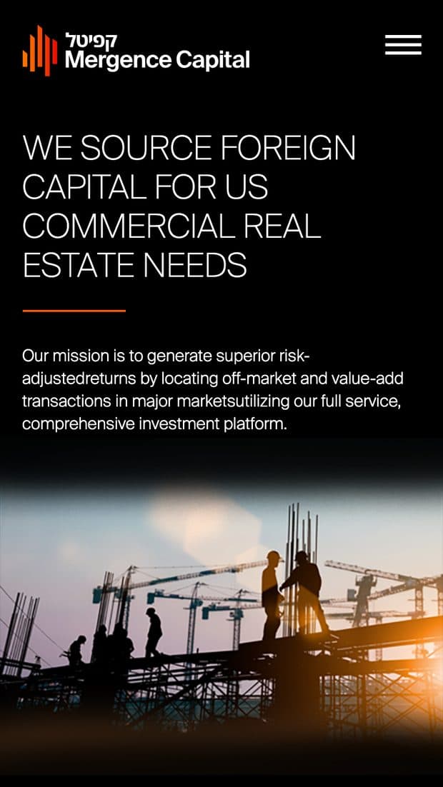
The Mergence Capital homepage on a phone: the headline set in caps above the mission statement, the dusk construction photograph beneath, and the Equity Transactions section following.
Capital on a phone, where the snapped sections become an ordinary stack.

Outcomes

  • A firm with no back catalogue still opens on evidence: four cities it actually works in, shown as film

  • The firm's own argument against slide-deck consulting is not contradicted by its website

  • Two audiences that share an owner but nothing else get their own front door, without either brand looking borrowed

  • One tagged grid means a video, a whitepaper and a press item publish through the same template