Skip to content
Digitalmohawk

04 / Shop Tasmania

Every deal is somewhere you can drive to

A deals and voucher marketplace for Tasmanian businesses. A restaurant, a hairdresser or a tour operator lists an offer, a customer buys a voucher, and the voucher gets scanned at the counter. Everything on the site is in the state.

The brief

Shop Tasmania sells discounted vouchers for local businesses: places to eat, haircuts, tours, gyms. It competes with national deal sites that carry the same kind of offer alongside thousands of others. What it has that they do not is that every deal is local. The site had to make that obvious, and it had to carry the whole path from browsing an offer to a barcode a merchant can scan.


What we built

  1. 01

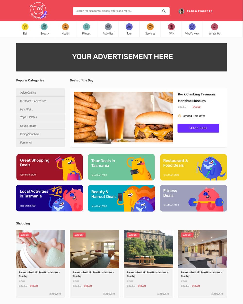
    Ten categories across the top, from Eat to Tour, each with its own icon, so the range is visible before anyone searches

  2. 02

    Deals of the Day at the top of the homepage, with the price, the original value and the saving on the same line

  3. 03

    Illustrated characters on the category tiles, so a page full of discounts does not read like a spreadsheet

  4. 04

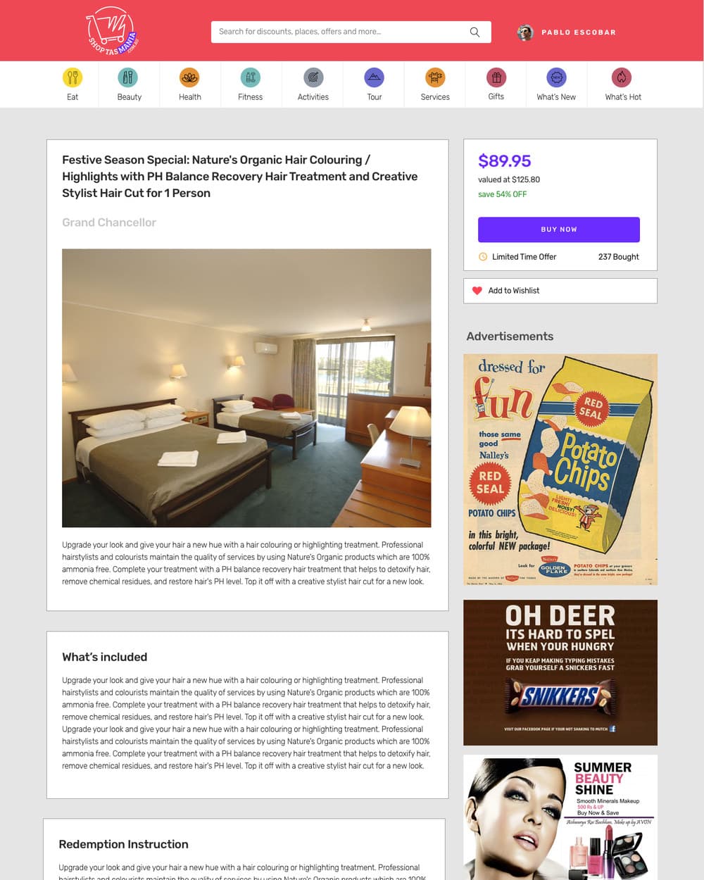
    A deal page that states the price, what it is valued at, the saving, and how many people have already bought it

  5. 05

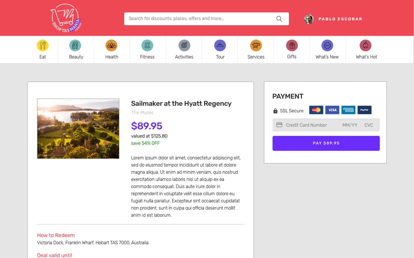
    Payment on the same page as the deal, so nobody loses the offer while looking for a checkout

  6. 06

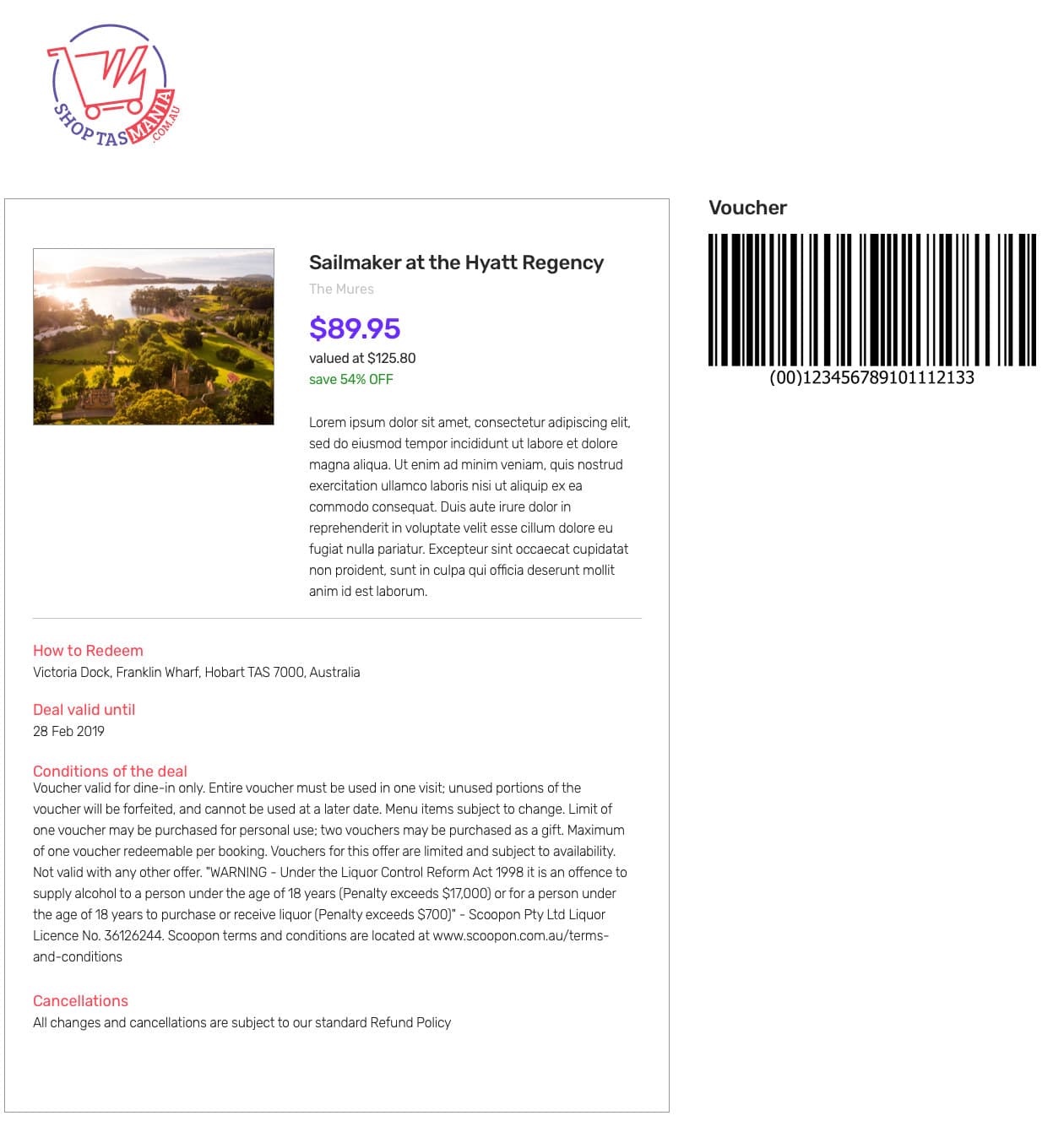
    The voucher as its own page: barcode, the address to redeem it at, the expiry date and the conditions in full

  7. 07

    Advertising slots designed in from the start, as a second income alongside commission on each deal

  8. 08

    Three homepage layouts drawn and compared before one was chosen

Screens

The homepage: category icons for Eat, Beauty, Health, Fitness, Activities, Tour, Services and Gifts, a Deal of the Day panel, and six illustrated category tiles.
The categories are the navigation. Somebody browsing for something to do on the weekend does not arrive with a search term.
A deal page for a hair treatment: the offer title, the venue, a photograph, the price at $89.95 against a value of $125.80, a Buy Now button, and a count of 237 bought.
Price, value, saving and how many have sold, all in one panel. The count is the only social proof a new marketplace has.
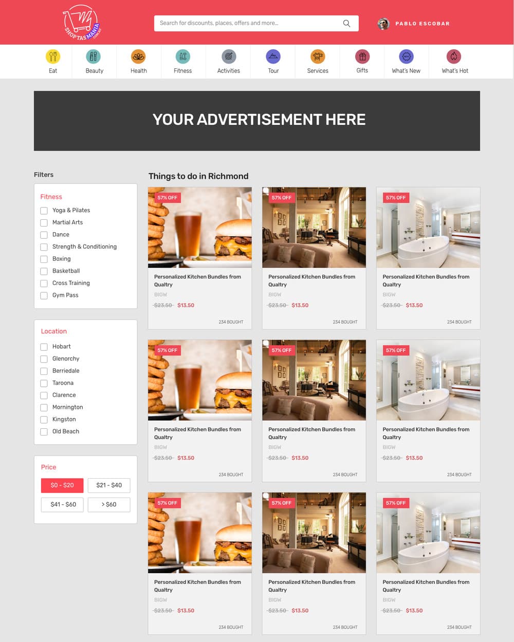
A category listing page showing a grid of deal cards, each with a photograph, a discount flag and a price.
Browsing a category. The saving is on the card, so nothing has to be opened to be compared.
The payment step: the deal summary on the left with how to redeem, validity and conditions, and a payment panel on the right taking a card number.
Paying happens beside the deal, not on a separate checkout. The conditions are visible while the card is being entered.
The printable voucher: the Shop Tasmania logo, the deal and its price, the address to redeem it at, the expiry date, the full conditions, and a barcode.
The voucher is the thing the customer actually receives. It is the page that has to work at a counter, on paper or on a phone.

Outcomes

  • The whole path is designed in one pass: browse, deal, pay, voucher

  • The voucher carries what a merchant needs at the counter, including the barcode and the expiry date

  • Conditions sit on the voucher itself, so they are read before the till and not argued about at it

  • Categories and icons make the range legible without anyone typing a search