Skip to content
Digitalmohawk

28 / CatholicCare Tasmania

You should not have to know what it is called

A public site for the Catholic Church's social services agency in Tasmania. It covers eight service lines, from family violence to tenancy support. The whole site is built around one question: how does someone find help when they do not know what the help is called?

The brief

CatholicCare runs eight service lines: tenancy support, family violence, children's services, a young women's shelter, counselling, multicultural programs, parenting and housing. People who need them rarely know which one applies, and almost never know the programme names. A normal services menu leaves that work to the visitor. This one had to do it for them, and it had to work for someone reading in a second language, on a phone, at night.


What we built

  1. 01

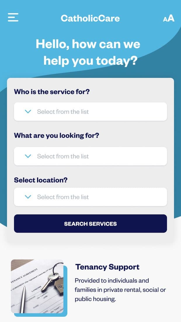
    A service finder that asks in plain terms who the support is for, what you are looking for and where you are

  2. 02

    Accessibility controls sit in the header, not the footer: two text sizes, a night mode and a language switch, reachable before a visitor has read anything

  3. 03

    Phone layouts drawn alongside the desktop ones at 621px, so the small screen was specified

  4. 04

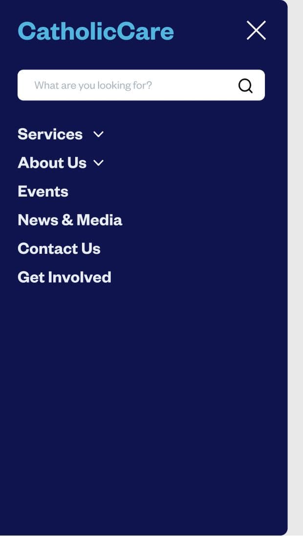
    A search-first mobile menu, on the assumption that someone arriving on a phone has a question

  5. 05

    Service, programme, event and article templates that keep the finder reachable from anywhere in the site
Screens

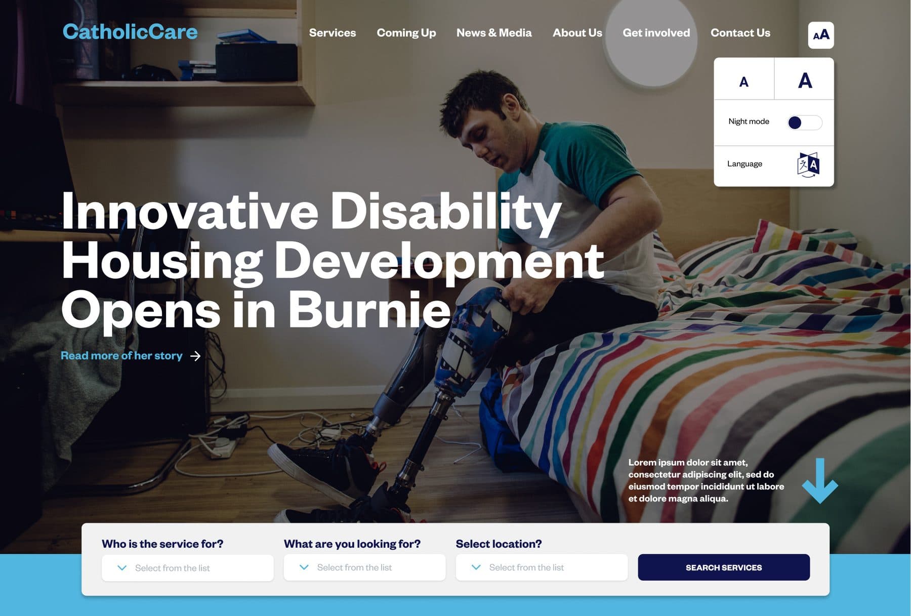
The CatholicCare homepage hero with the accessibility panel open in the top right, offering a small and large A, a night mode toggle and a language switch. A service finder with three dropdowns sits across the bottom.
Accessibility held in the header, in 2019. Two text sizes, a night mode and a language switch, decided before the visitor has read a word, not after they have given up. The finder sits across the fold below it.
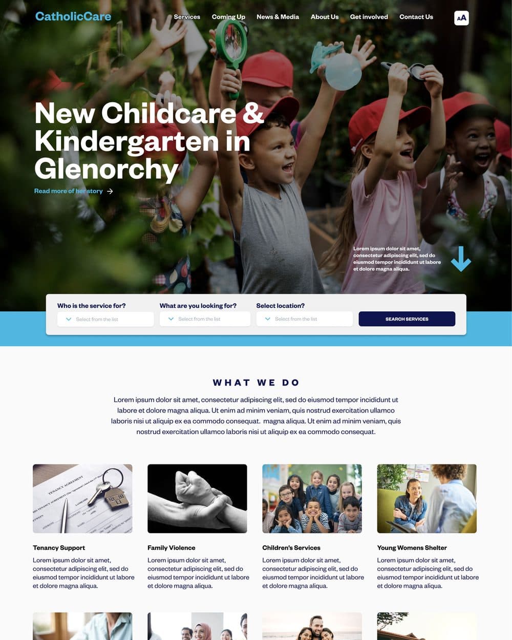
The homepage below the fold, with the service finder over the hero photograph and a grid of eight service cards headed 'What we do'.
Eight service lines, one entry point. The finder sits above them so nobody has to read all eight to find the one they need.
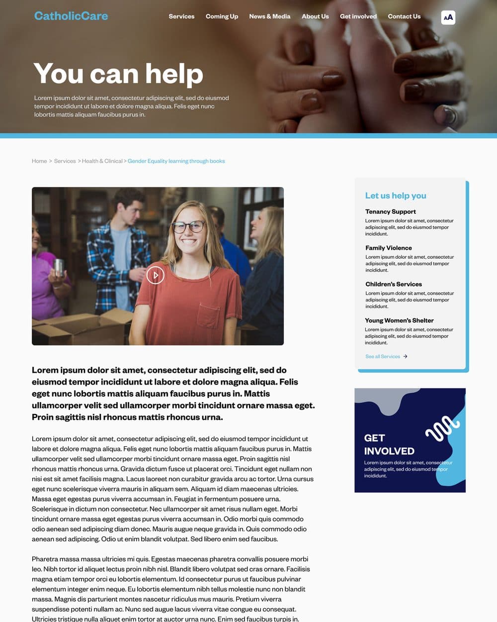
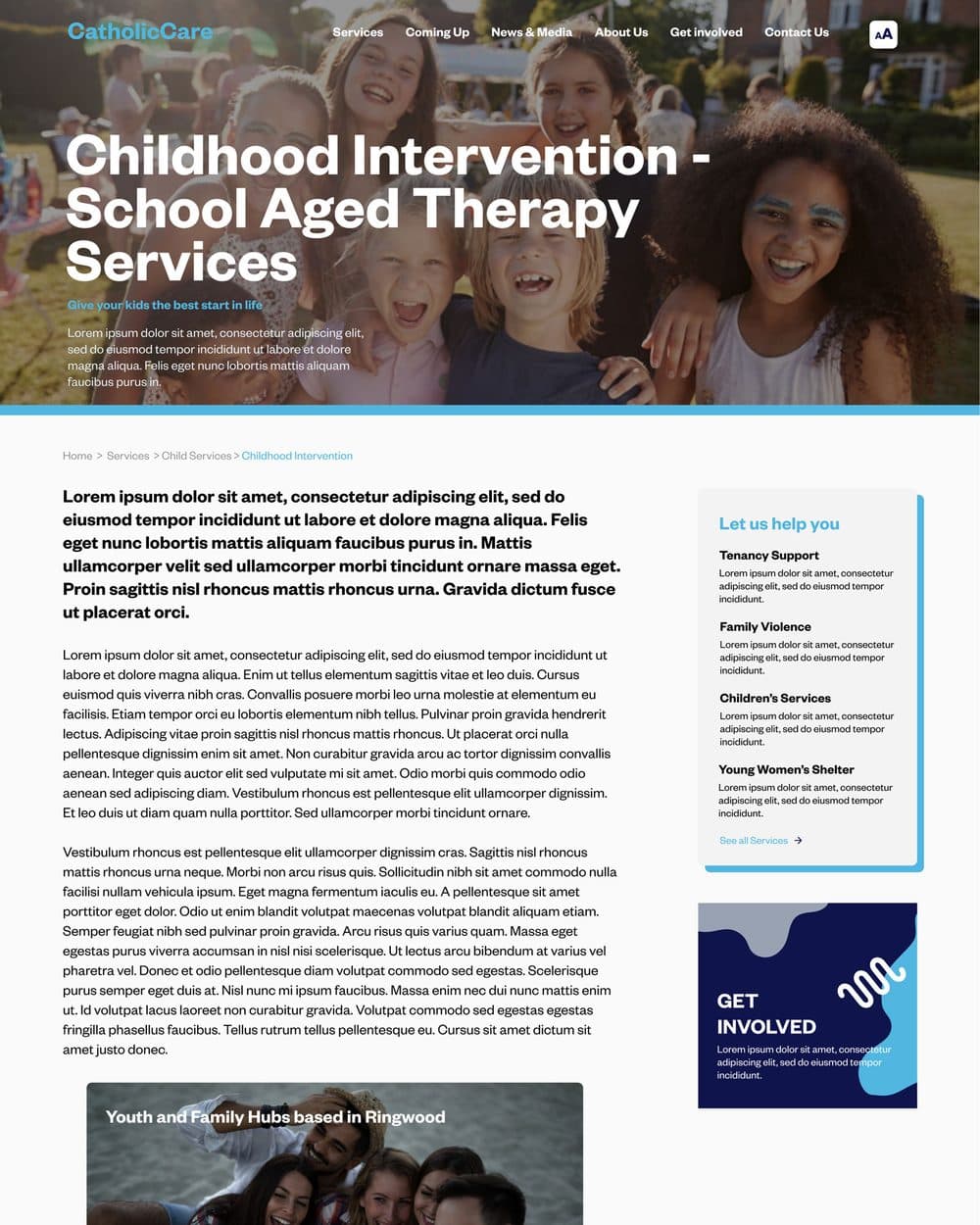
A programme detail page laying out what the programme offers, who it is for and how to make contact.
Programme detail. Every leaf page answers who it is for and what happens next before it explains the organisation.
The volunteer page under Get involved, setting out volunteering routes and an enquiry path.
Get involved runs on the same templates as the service pages, so the supply side and the demand side never diverged.
The homepage on a phone, with the hero headline, the service finder stacked into full-width fields, and service cards below.
Phone home. The finder stacks rather than collapsing into a link.
The phone menu open over a dark blue ground, with a 'What are you looking for?' search field above the navigation list.
The phone menu opens on a search field, not a list. On a small screen the question comes first.
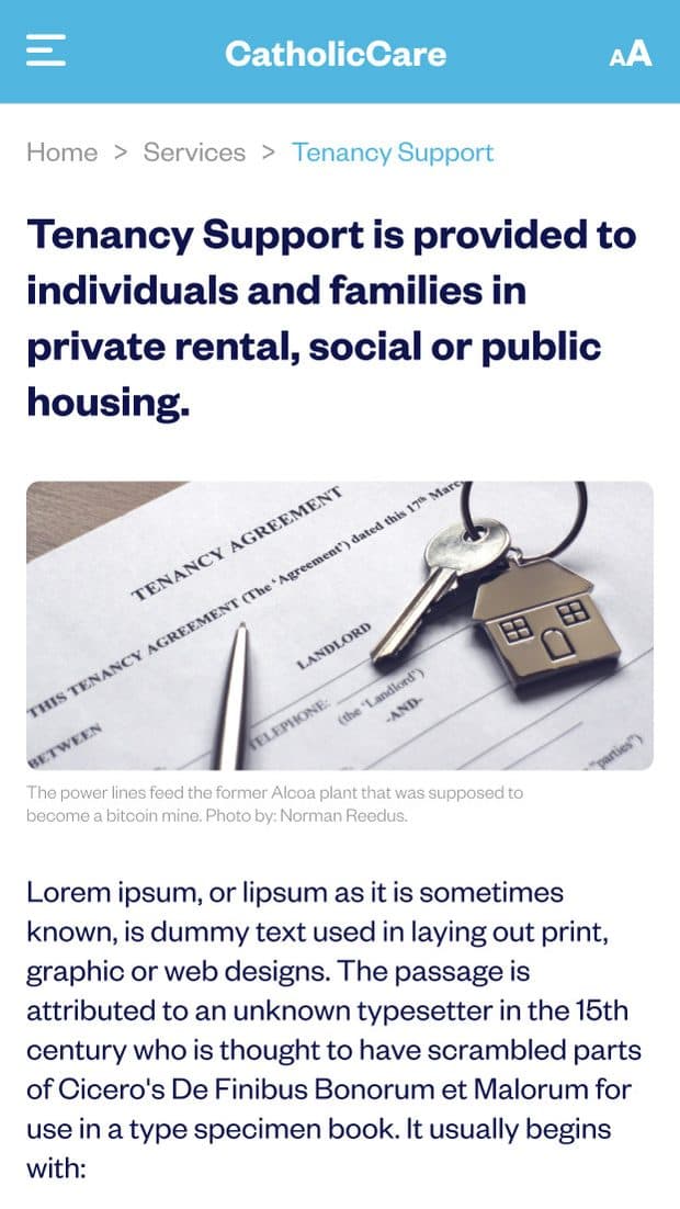
The services listing on a phone, with each service line as a full-width card.
Services on a phone, one full-width target per line.

Outcomes

  • Seven years on, the three-facet finder is still how CatholicCare routes people to support

  • Someone can reach the right service without knowing its name, its programme code or which part of the organisation runs it

  • Text size, contrast and language sit in the header, which is where they get used

  • Desktop and phone were specified together, so the small screen was never a reduction of the large one