Skip to content
Digitalmohawk

29 / Salamanca Fresh

The grower's name goes on the front page

A site for an independent Tasmanian grocer with seven shops around Hobart. It had one job: make the case that the produce is bought direct from growers, with no wholesaler in between. There is no checkout, because every sale still happens in a shop.

The brief

Seven independent grocers competing with two national chains. They cannot win on price. What they have is that they buy direct from growers, and a shelf of produce cannot say that for itself. The site had to make the argument believable, and had to send people to a shop rather than to a cart.


What we built

  1. 01

    Put the grower's name in the hero (From Tex to you, From Tye to you) and ran that device across the whole site

  2. 02

    A suppliers page that gives every grower a portrait and their own advice on keeping the produce fresh

  3. 03

    Weekly specials as a filterable catalogue, with the price and the saving on each card, so the offer is legible before anyone leaves the house

  4. 04

    Recipes filtered by meal type and credited to whoever wrote them, giving the shop a reason to be opened weekly

  5. 05

    All seven store locations and numbers in the footer of every page, because the conversion is a visit
Screens

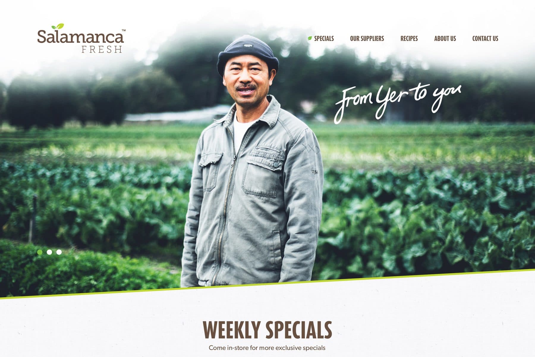
The Salamanca Fresh homepage: a grower standing in a field of brassicas under the handwritten line 'From Yer to you', above a Weekly Specials row showing mandarins, broccoli, rib-eye steak and tea with prices and savings.
The hero is a grower, not produce, and the handwritten line names him. Weekly specials sit directly beneath with the price and the saving already visible.
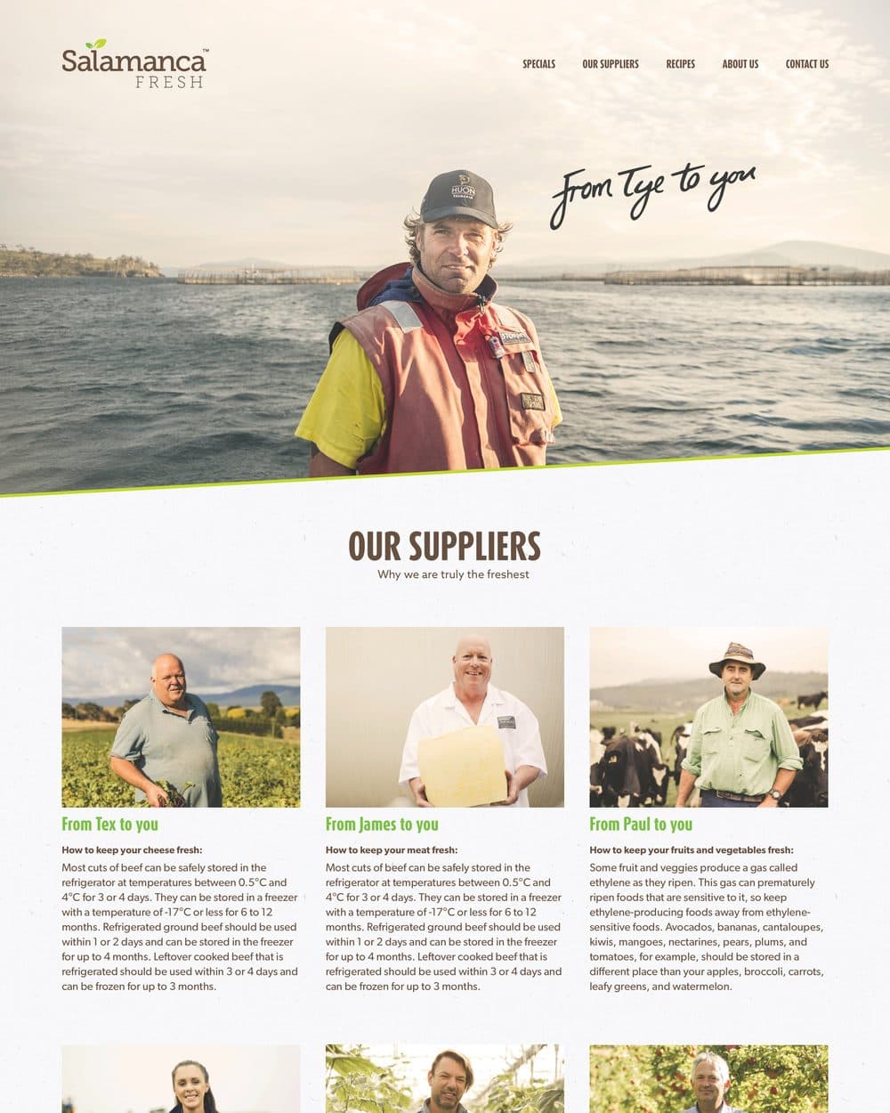
The Our Suppliers page, headed 'Why we are truly the freshest', with a grid of grower portraits each titled 'From Tex to you', 'From James to you', 'From Paul to you' and carrying advice on keeping food fresh.
Six growers, six portraits, and each one gives away practical advice on keeping the food they grew. Expertise offered rather than withheld.
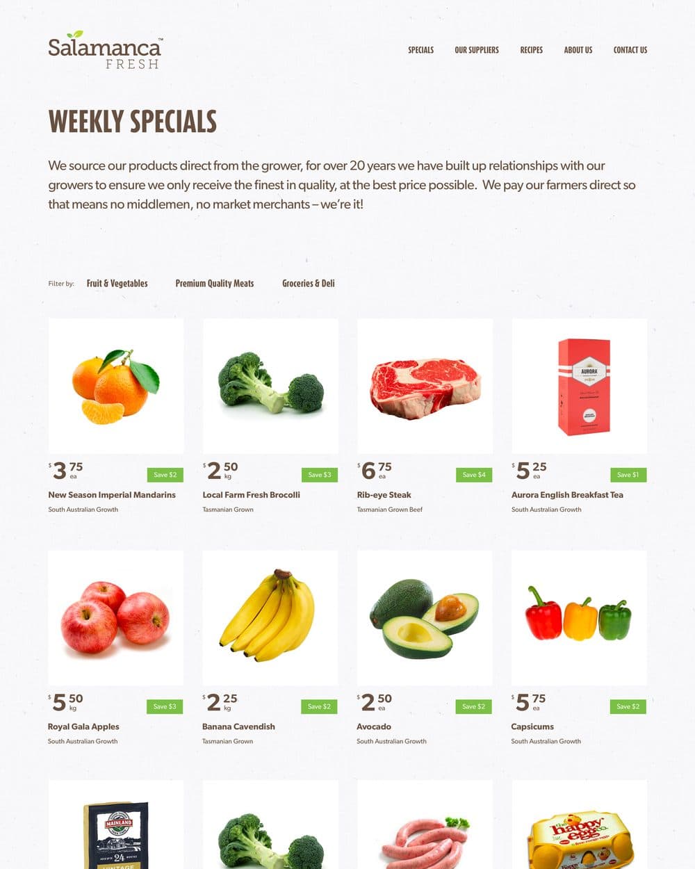
The Weekly Specials page, filterable by fruit and vegetables, meats, or groceries and deli, showing a grid of products with price, unit and a green savings tag.
Specials filter by department. Price, unit and saving sit on the card. The decision is made before the drive, not in the aisle.
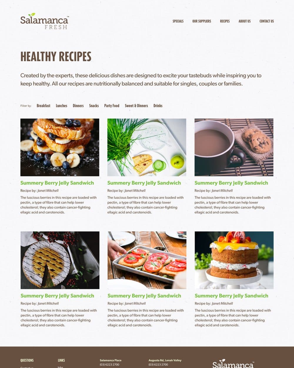
The Healthy Recipes page, filterable by breakfast, lunches, dinners, snacks, party food, sweets and drinks, with a grid of photographed dishes each credited to a named author.
Recipes filter by meal and carry a byline. A grocer's reason to be visited in the week.

Outcomes

  • The provenance claim is made by named people with faces

  • Specials are readable before the trip, taking on the job the letterbox catalogue used to do

  • Nine years on, the three pillars still structure the business's site: weekly specials, local suppliers, recipes

  • Scoped without a cart, so the site drove footfall to seven shops instead of competing with their own shelves