Skip to content
Digitalmohawk

25 / Decorama

Shop the room, not the catalogue

A site for a Hobart curtain, blind and homewares maker. The catalogue is entered through photographs of finished rooms, where each product carries a marker you can open.

The brief

Curtains and blinds are hard to shop from a grid. A swatch tells you nothing about how a fabric hangs in a room, and customers do not know the names of the styles they like. They know the room they saw.


What we built

  1. 01

    Room photographs as the way in, with a marker on each product in the shot

  2. 02

    A marker opens a card naming the product and its range, so the fabric in the picture has a name

  3. 03

    Products organised by what they are, blinds, curtains, cushions and accessories, for people who arrive knowing

  4. 04

    A room inspiration section kept separate from the catalogue, so browsing and buying are different modes

  5. 05

    Curtains made and measured locally stated plainly, since that is the difference from an online fabric shop
Screens

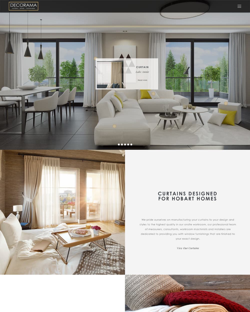
The Decorama homepage: a photograph of a furnished living room with markers on the curtain, cushions and sofa, one of them opened to show a card reading Curtain, Lake Annie.
Markers on the room. Open one and the fabric in the photograph has a name.
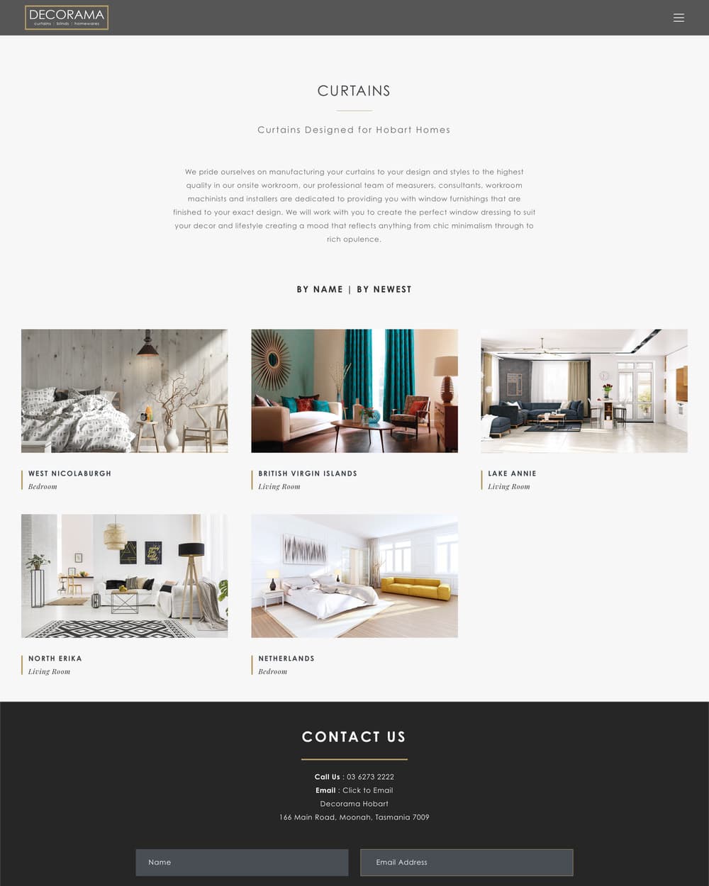
The curtains category page: a grid of curtain styles photographed hanging in rooms, each named.
The category page for people who already know they want curtains. Every style is photographed hanging, not folded.
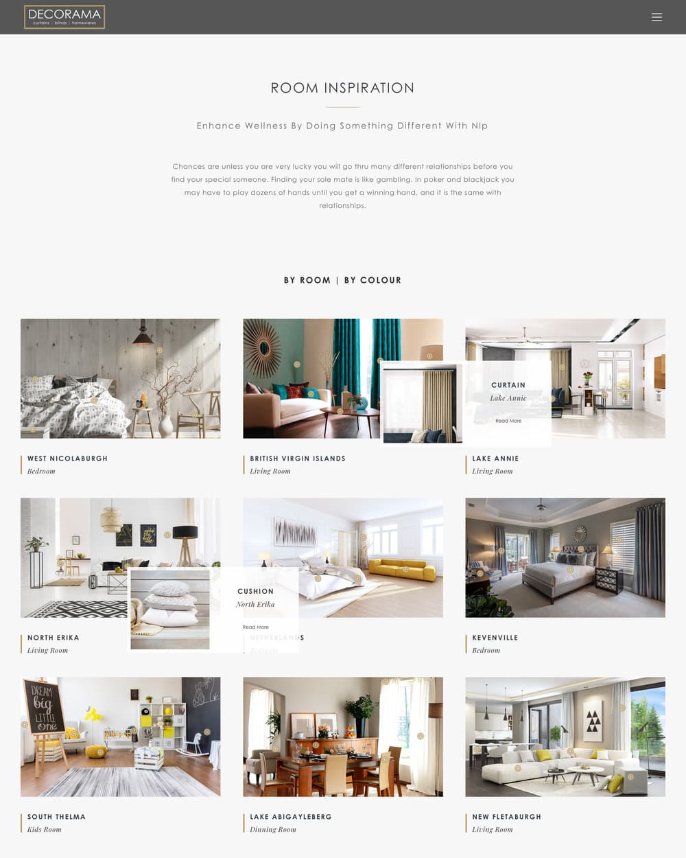
The room inspiration page: full-width photographs of finished rooms with markers on the products in them.
Inspiration kept separate from the catalogue, so browsing and buying stay two different modes.

Outcomes

  • A customer can point at the room they liked and find the fabric in it

  • Browsing a room and buying a product are two different pages, doing two different jobs