Skip to content
Digitalmohawk

30 / Pathways Tasmania

The line ends at the donate button

A fundraising site for a Tasmanian charity that runs supported accommodation for young people facing homelessness, addiction and family breakdown. A single drawn line runs down the whole page, from a figure in a tunnel at the top to a donation at the bottom.

The brief

Pathways houses young Tasmanians with high needs: addiction, mental illness, family breakdown, sleeping rough. The money comes from donors and corporate partners, most of whom have no experience of any of it. Statistics do not build that understanding. The site had to show a stranger what recovery looks like before asking them to fund it, without turning the people it serves into case studies.


What we built

  1. 01

    A single line runs down the length of the homepage with a node at each stage, so scrolling the page is walking the journey

  2. 02

    The tone shifts along that scroll: monochrome tunnels at the top, lit portraits through the middle, colour by the end

  3. 03

    Stories carried in the first person and attributed, in the client's own words rather than paraphrased by the charity

  4. 04

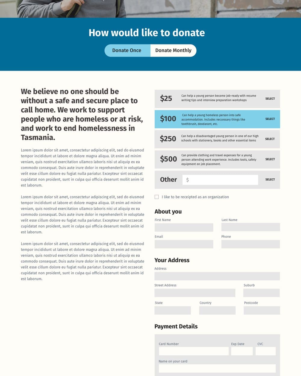
    Donation tiers each state what the money buys: $25 for interview preparation, $100 for safe accommodation, $500 for tools and travel to a work placement

  5. 05

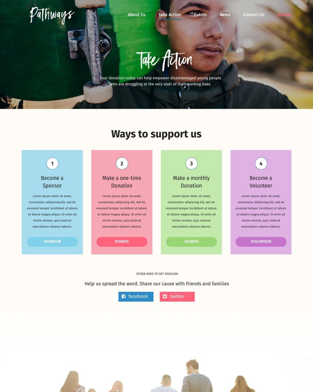
    Four numbered, colour-coded ways to support, so a sponsor, a one-off donor, a monthly giver and a volunteer each have their own door

  6. 06

    The line terminates at the donation panel, so the ask lands after the understanding

Screens

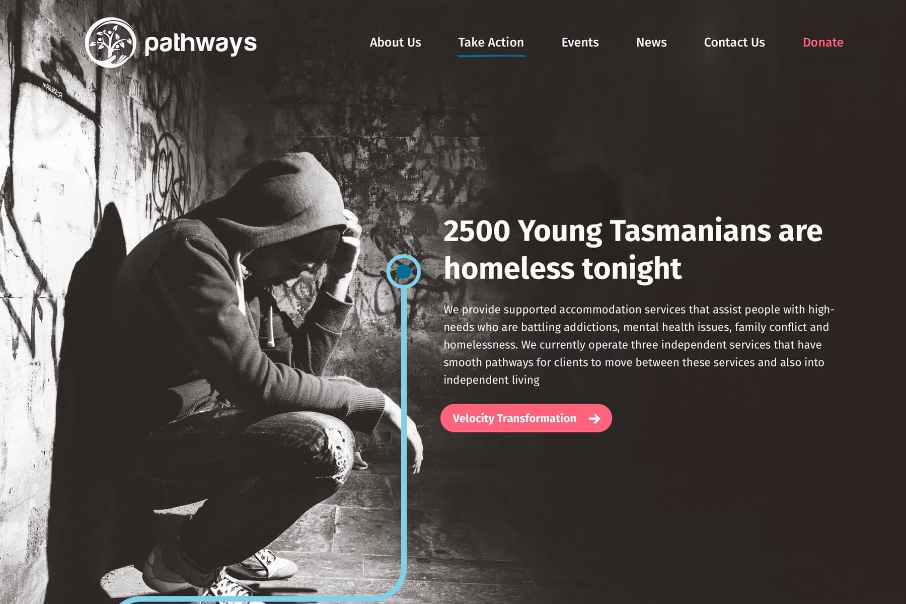
The Pathways homepage: a hooded figure crouched against a graffitied wall in monochrome, headed '2500 Young Tasmanians are homeless tonight', with a drawn blue line running from a node beside the headline down and off the bottom of the screen.
The line starts at the statistic and does not stop until the donation. Every stage of the journey hangs off a node on it.
The donate page with a Donate Once and Donate Monthly toggle, then a column of amounts ($25, $100, $250, $500 and Other), each with a sentence describing what it pays for, followed by name, address and payment fields.
The strongest thing on the site. $25 is interview preparation, $100 is safe accommodation and a toothbrush, $500 is tools and travel to a placement. Nobody has to guess what their money does.
The Take Action page headed 'Ways to support us', with four numbered colour-coded cards: become a sponsor, make a one-time donation, make a monthly donation, become a volunteer, each with its own call to action.
Four supporters, four doors. A monthly giver and a volunteer want different things, and neither is well served by a single Donate button.
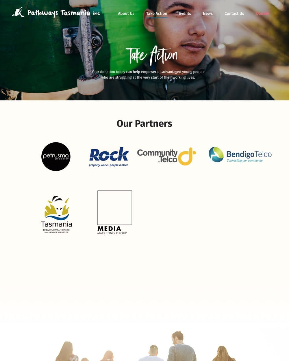
The Our Partners page showing corporate and government supporter logos including Petrusma Property, Community Telco, Bendigo Telco and the Tasmanian Department of Health and Human Services.
Partners given a page rather than a strip in the footer. For a charity carrying government funding, the company it keeps is part of the argument.
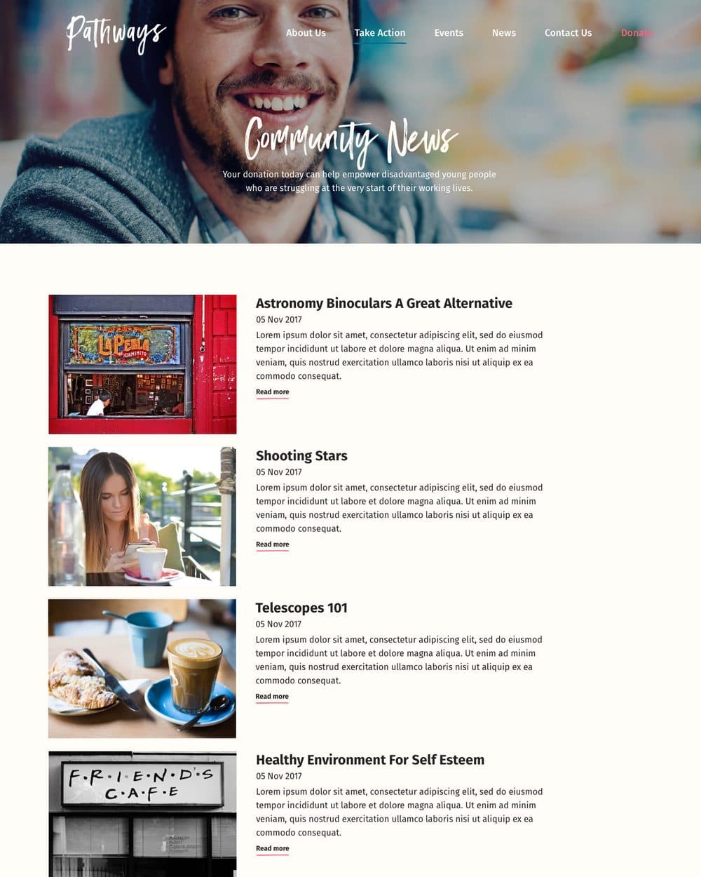
The Community News page, a dated list of articles each with a photograph, headline, standfirst and read-more link.
Community news on a light ground, deliberately away from the monochrome of the homepage arc.

Outcomes

  • A donor walks the arc before anything is asked of them. The ask sits at the end of the line

  • Every amount is answerable: a giver knows what $100 does before they choose it

  • Recovery reads as a sequence with stages rather than a before-and-after photograph

  • The people served speak in the first person, so the charity is not narrating on their behalf