Skip to content
Digitalmohawk

19 / United Home Loans

The comparison rate next to the rate

A site for a Tasmanian mortgage broker. The rate table is the product, so it carries the comparison rate beside the headline rate, a plain English explanation of each loan, and the caveat that rates do not apply to every scenario.

The brief

Australian lending advertising is regulated, and the headline rate on its own is close to meaningless. A borrower comparing brokers needs the comparison rate, the loan type and the conditions in the same eyeline, and most rate tables bury two of the three.


What we built

  1. 01

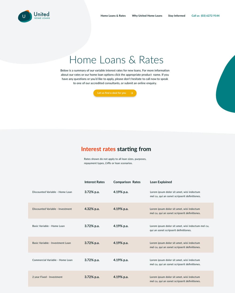
    Interest rate and comparison rate in adjacent columns, at the same size, so neither is the fine print

  2. 02

    A Loan Explained column on every row, in plain words rather than product names

  3. 03

    The scope caveat printed above the table rather than in a footnote, since it changes how every number should be read

  4. 04

    One clear action beside the table for people who would rather talk to somebody than read it

  5. 05

    A phone number in the navigation, because a mortgage question is usually a phone call

Screens

A rate table with columns for Interest Rates, Comparison Rates and Loan Explained, listing discounted variable home loan and investment rates, under a note that rates do not apply to all loan sizes, purposes, repayment types or scenarios.
Rate, comparison rate and a plain English explanation on every row, with the caveat above the table instead of under it.
The United Home Loans homepage with the brand mark, navigation for home loans and rates, why United, and stay informed, and a phone number.
Four things in the navigation, one of which is a phone number.

Outcomes

  • A borrower can compare loans on the number that actually compares them

  • The conditions that qualify every rate are read before the rates, not after